
Hove Food Hub
A brand for a food hub.
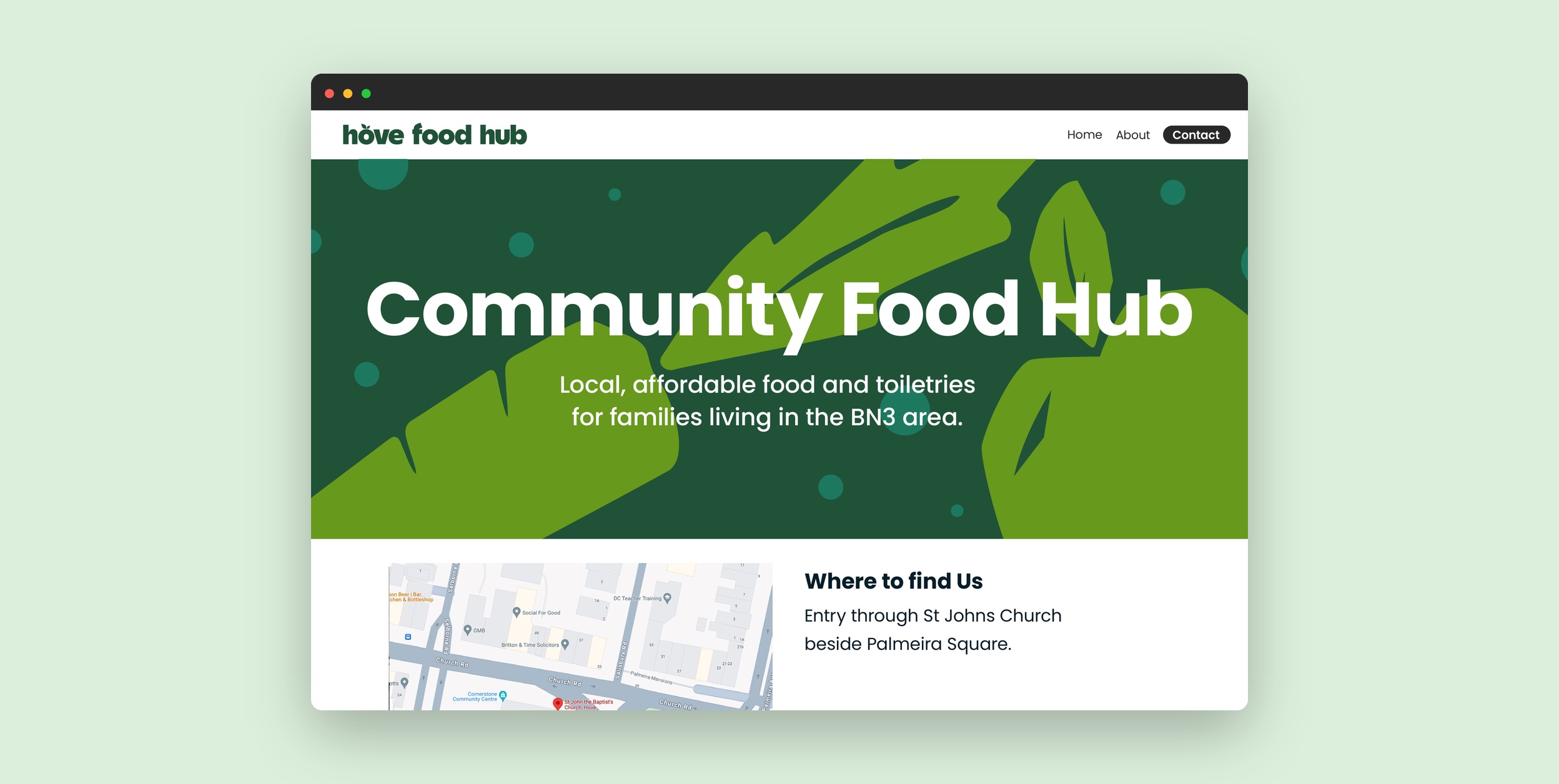
Hove Food Hub offers local, affordable food and toiletries to families in Brighton & Hove. We concepted the brand and the website: a logotype and mark, fruit and vegetable motifs, and a three-page site for finding the hub, donating and getting in touch.
Community, roots, fresh, friendly.
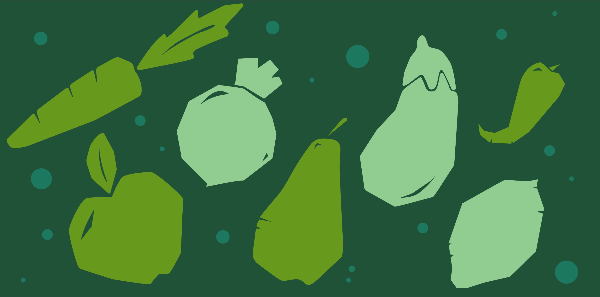
Those were the four words in the brief. The leaf and vegetable shapes carry them: behind the logotype, inside the mark, across the motif set and behind the headline on the website mockup. Poppins carries the text, chosen because it is free and easy to read. The wireframes keep the site to three pages: home, about and contact.