
Healthwords
Health, in everyday words.
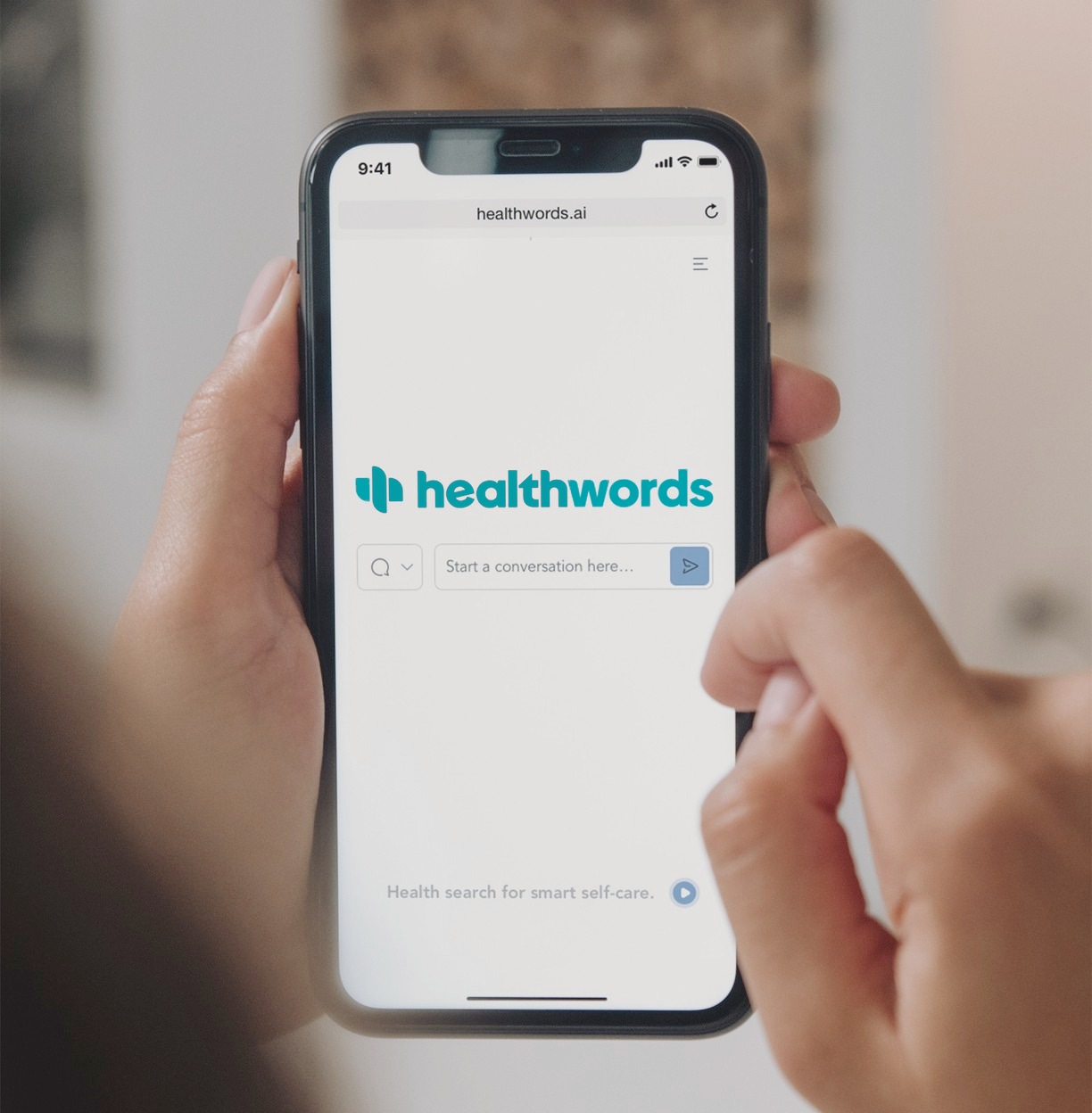
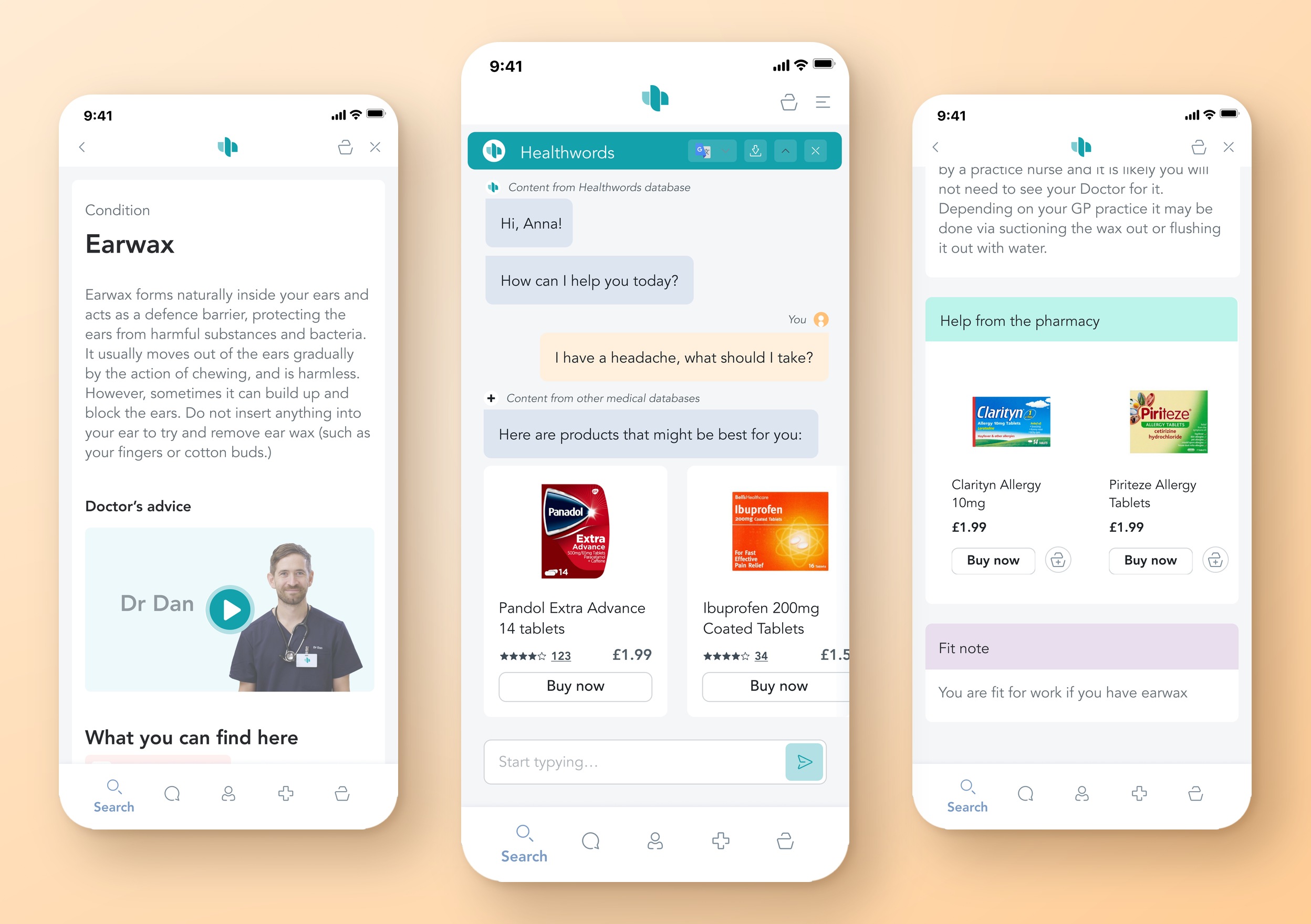
Healthwords is a conversational health assistant. You describe what’s wrong, and it points you to a doctor or pharmacist or, for low-stakes problems, to everyday products such as paracetamol or hay fever tablets. The company was changing its name and its product at the same time, so we built the brand, helped design the product alongside their developers and made the advertising.
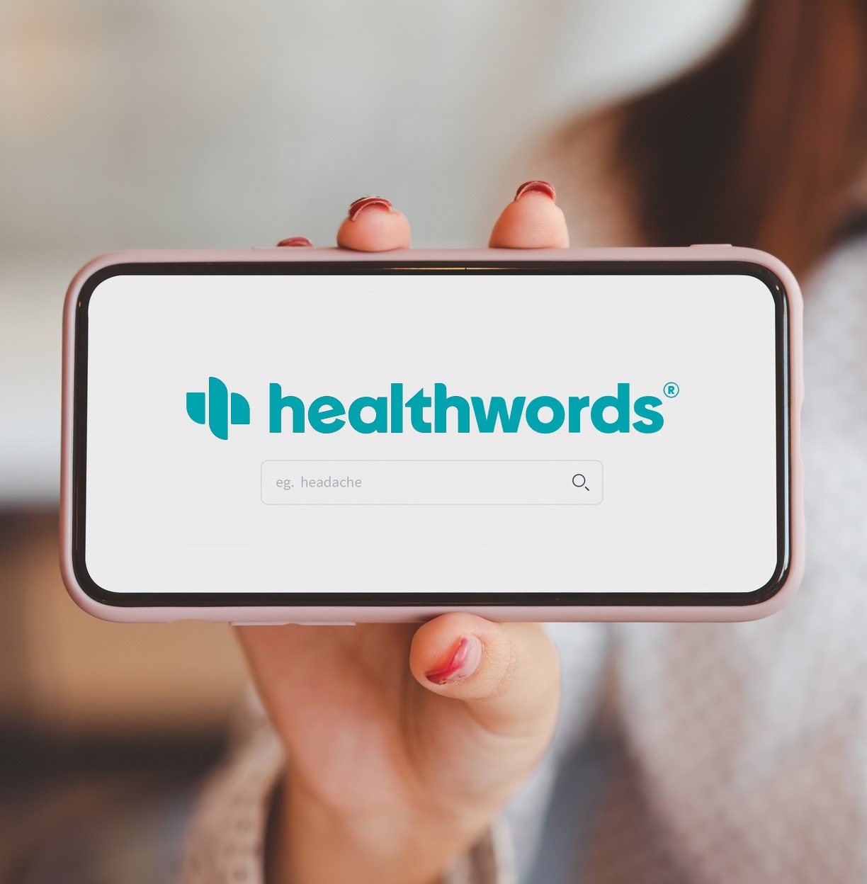
Friendly enough to ask, trusted enough to act on.
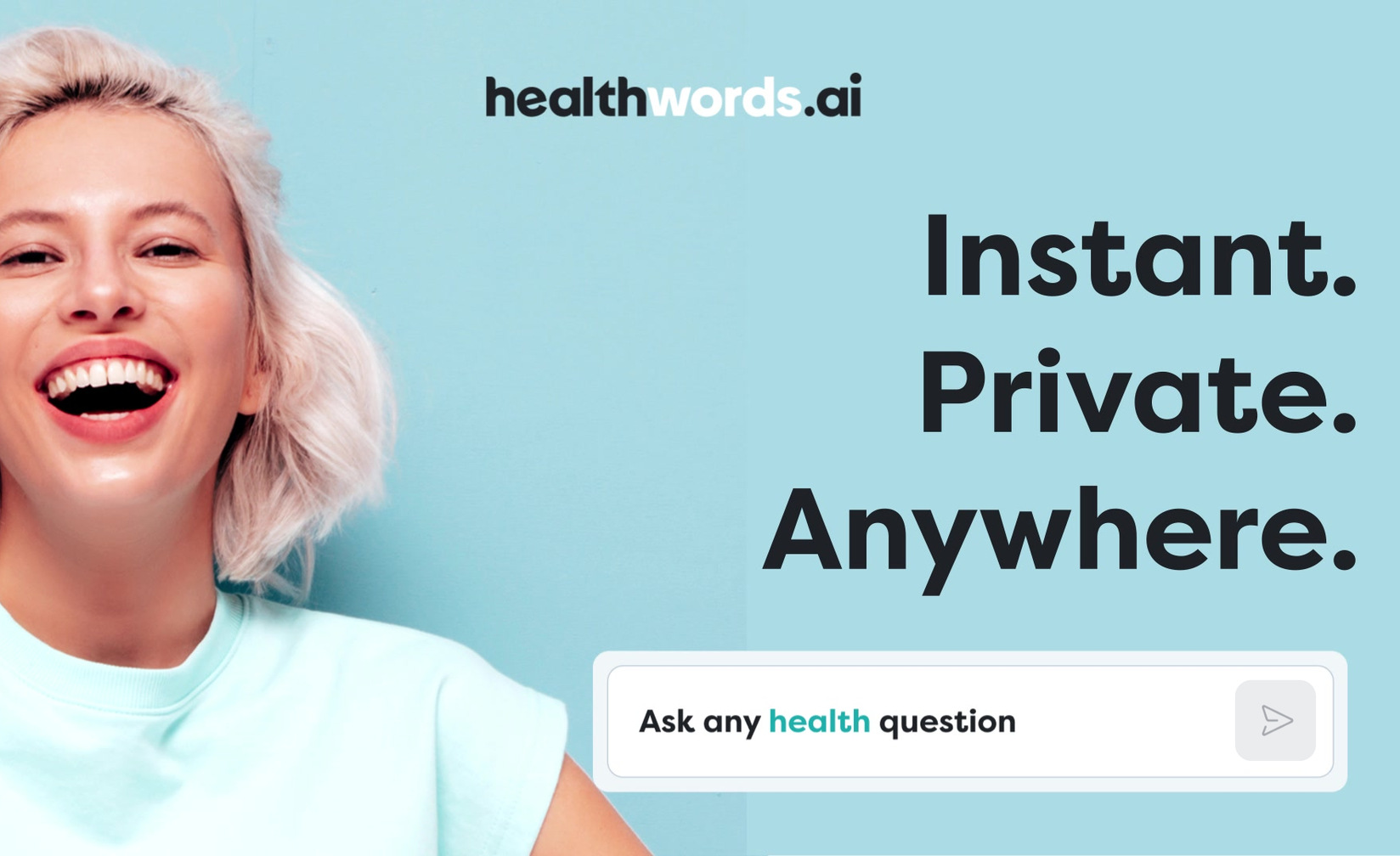
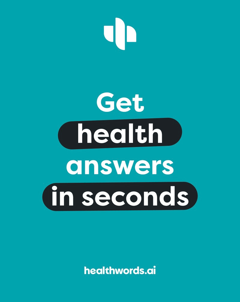
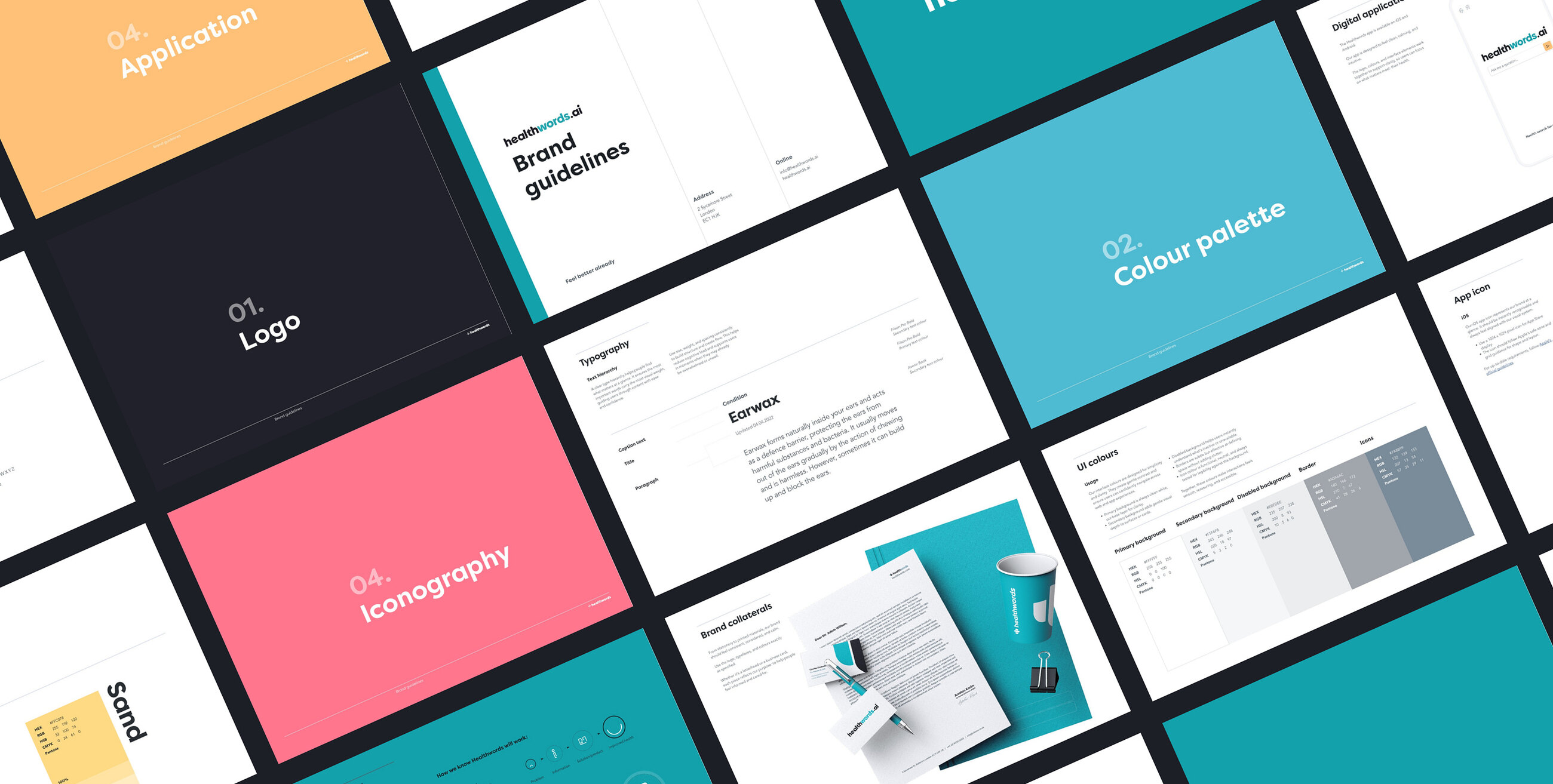
People describe their ailments in everyday words, and search is the natural place to do it, so the brand had to speak the same way, in plain conversational language. The mark overlaps an h and a w, with a plus for pharmacy built in. A teal-led palette, warmed with yellow and pink, runs from the interface to the print ads.
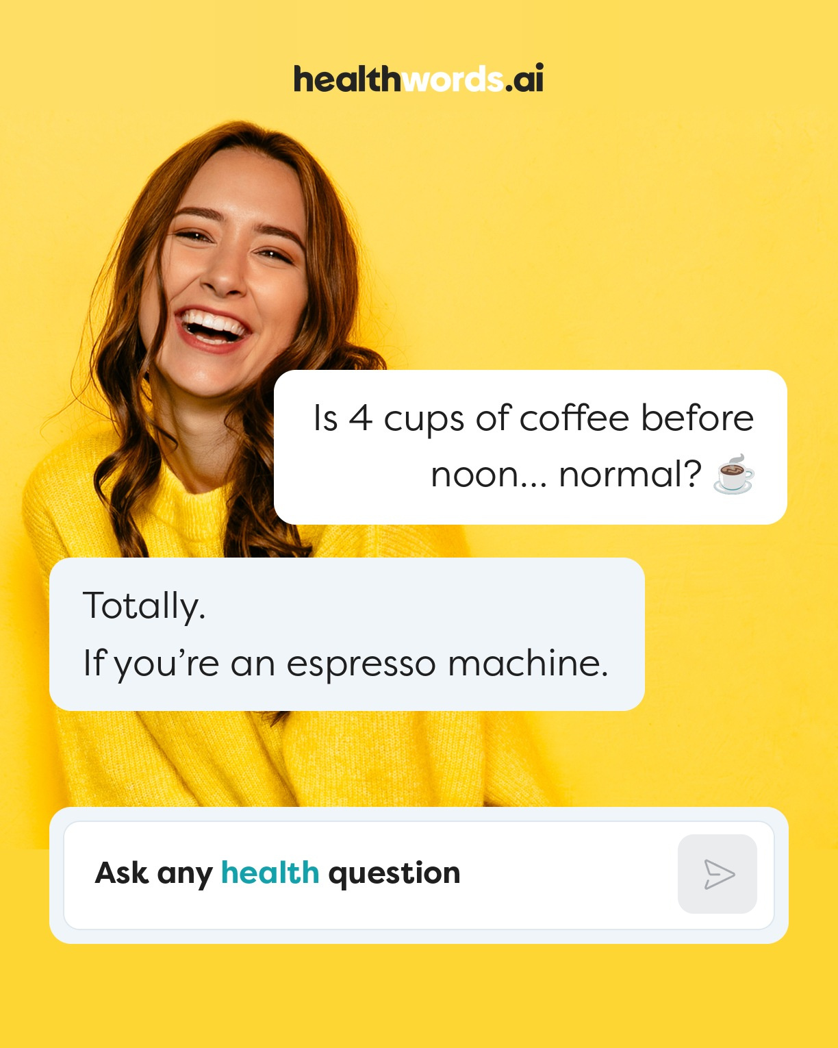
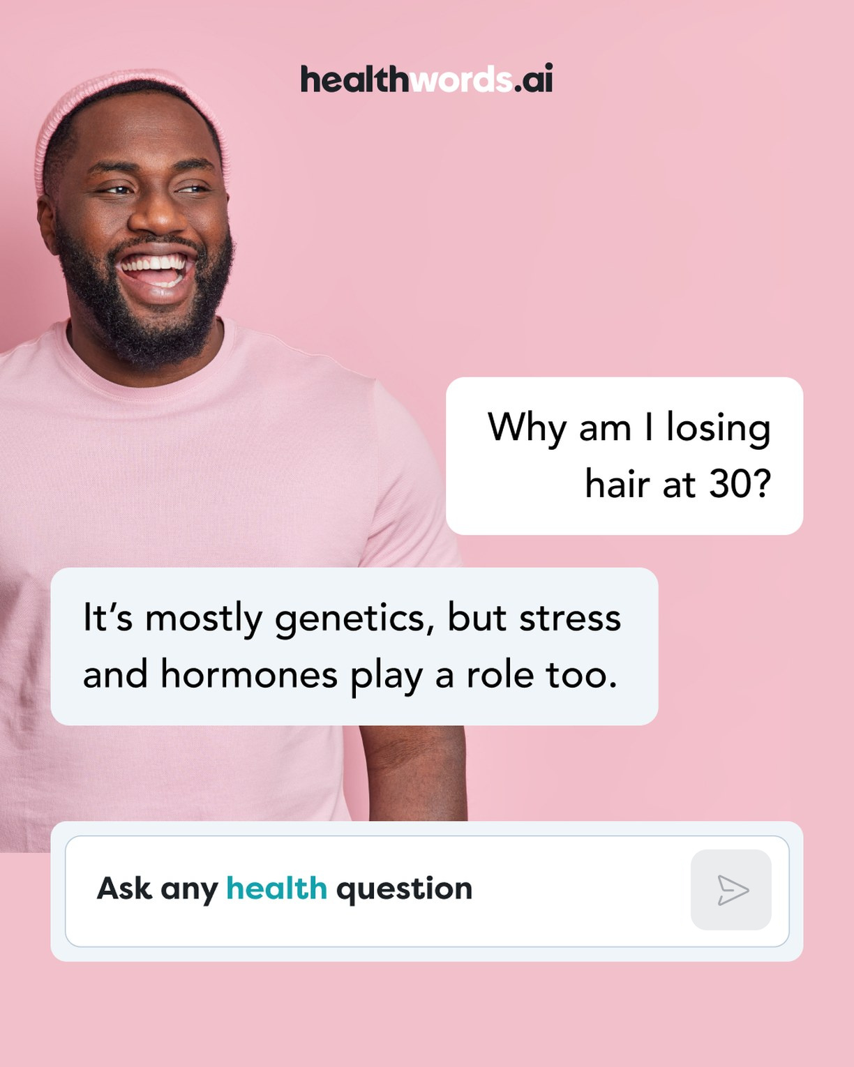
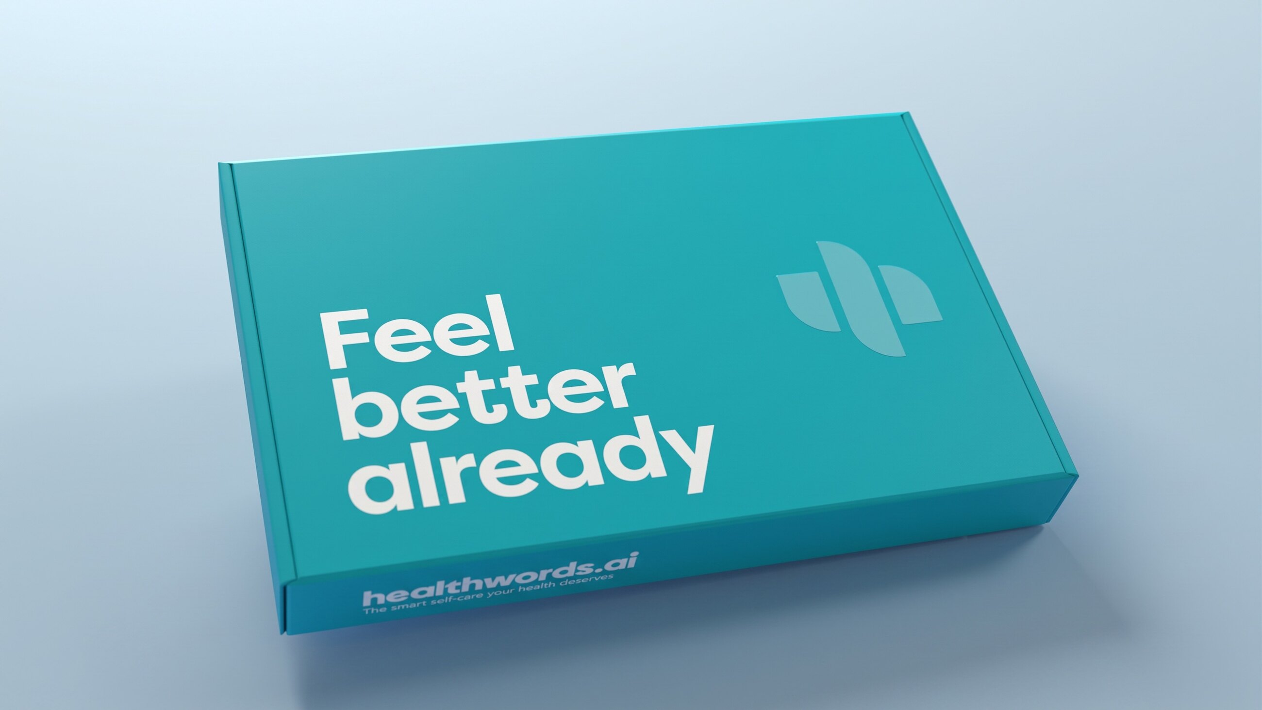
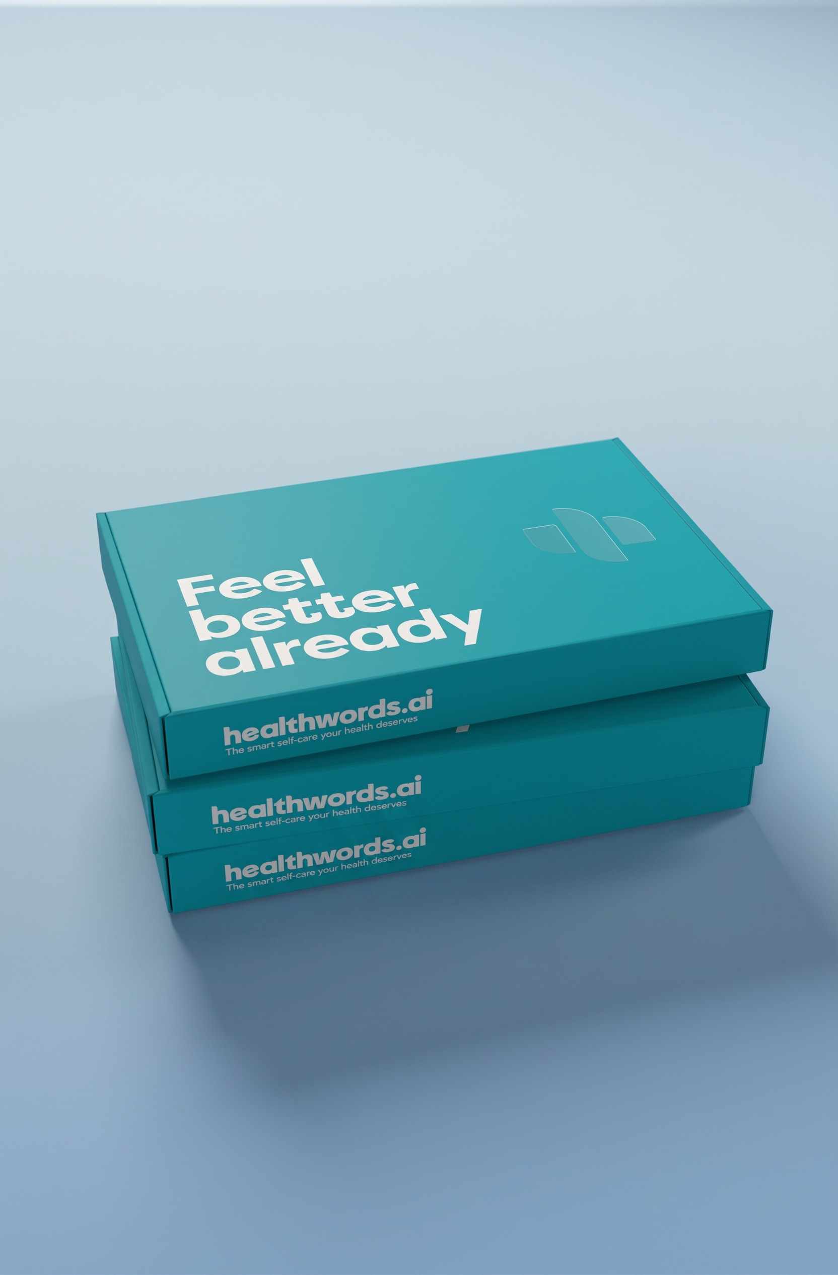
The name was new and so was the product, so the campaign had to introduce both at once. Digital and print ads used chat bubbles. We also proposed delivery boxes carrying the line Feel better already.
On the web
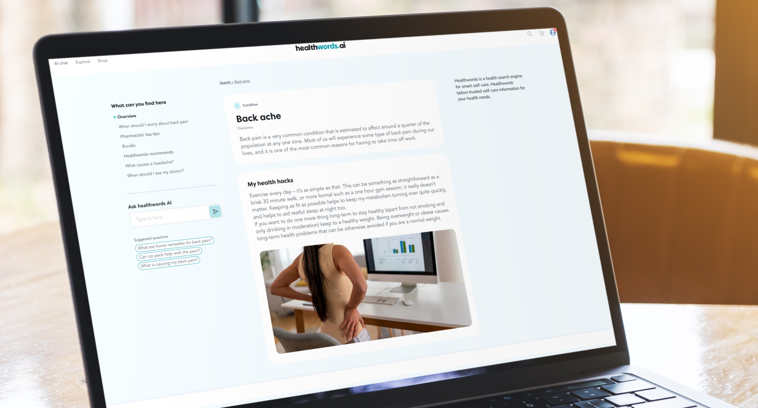
A condition page with the answer up front, and a pharmacist’s advice and the right products close by.