
EnableAll
Accessibility, in colour.
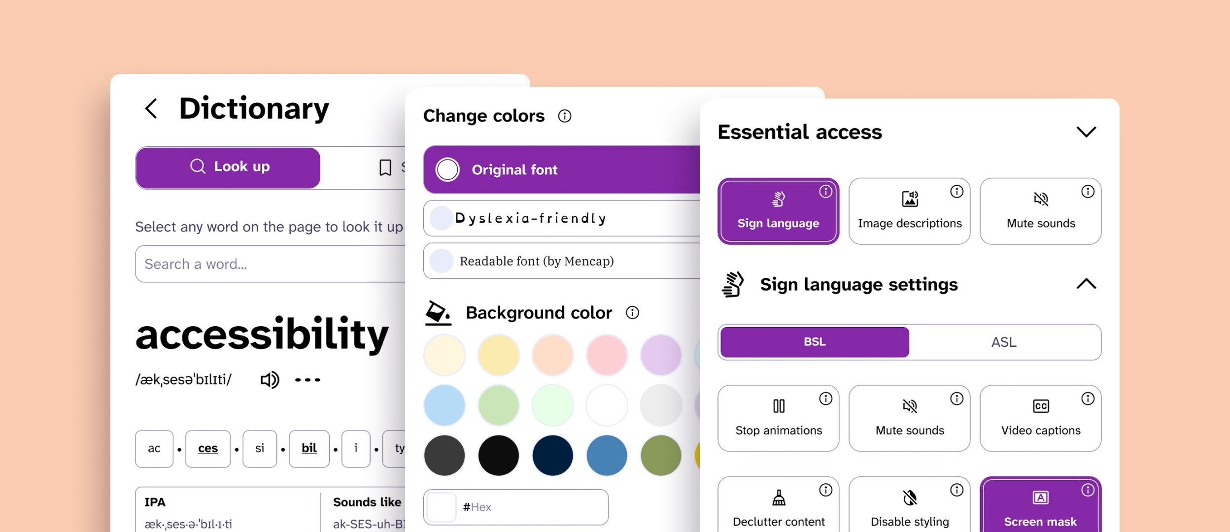
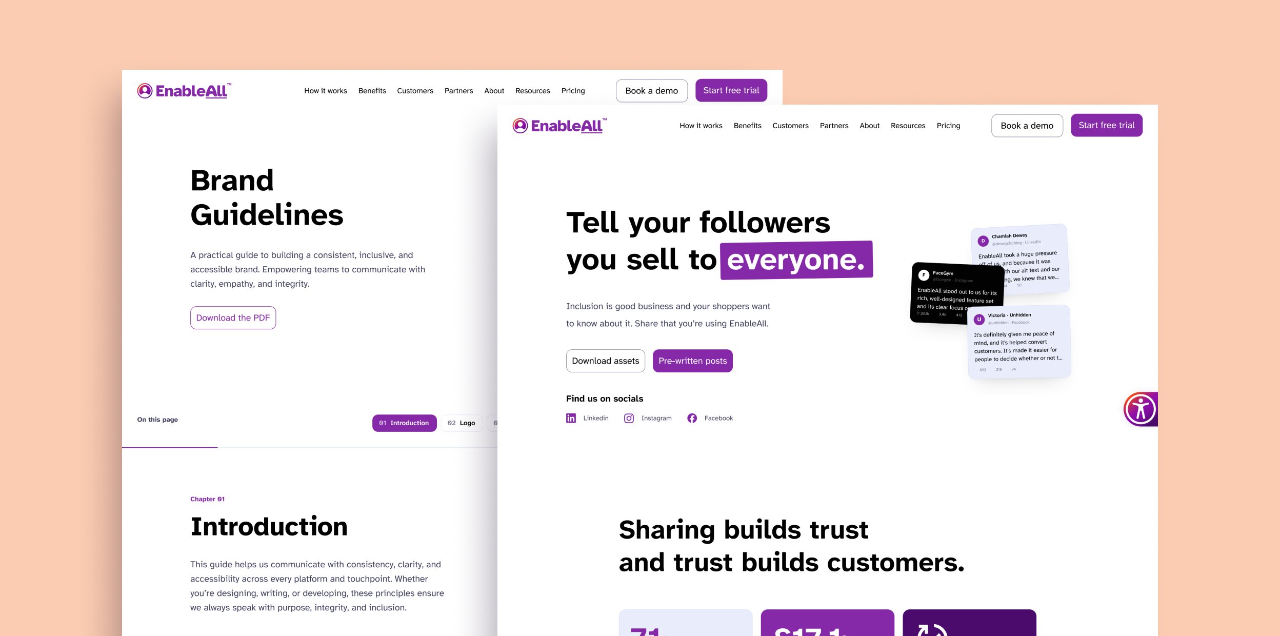
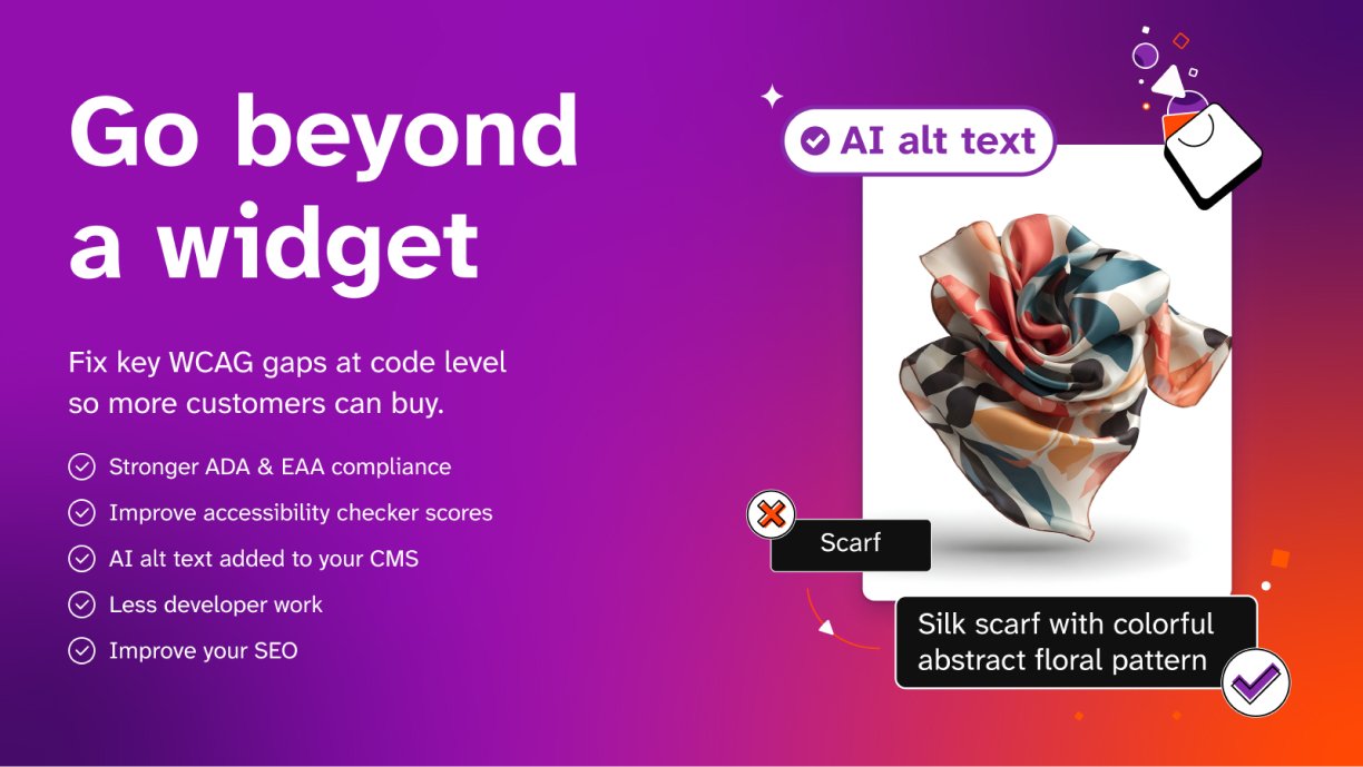
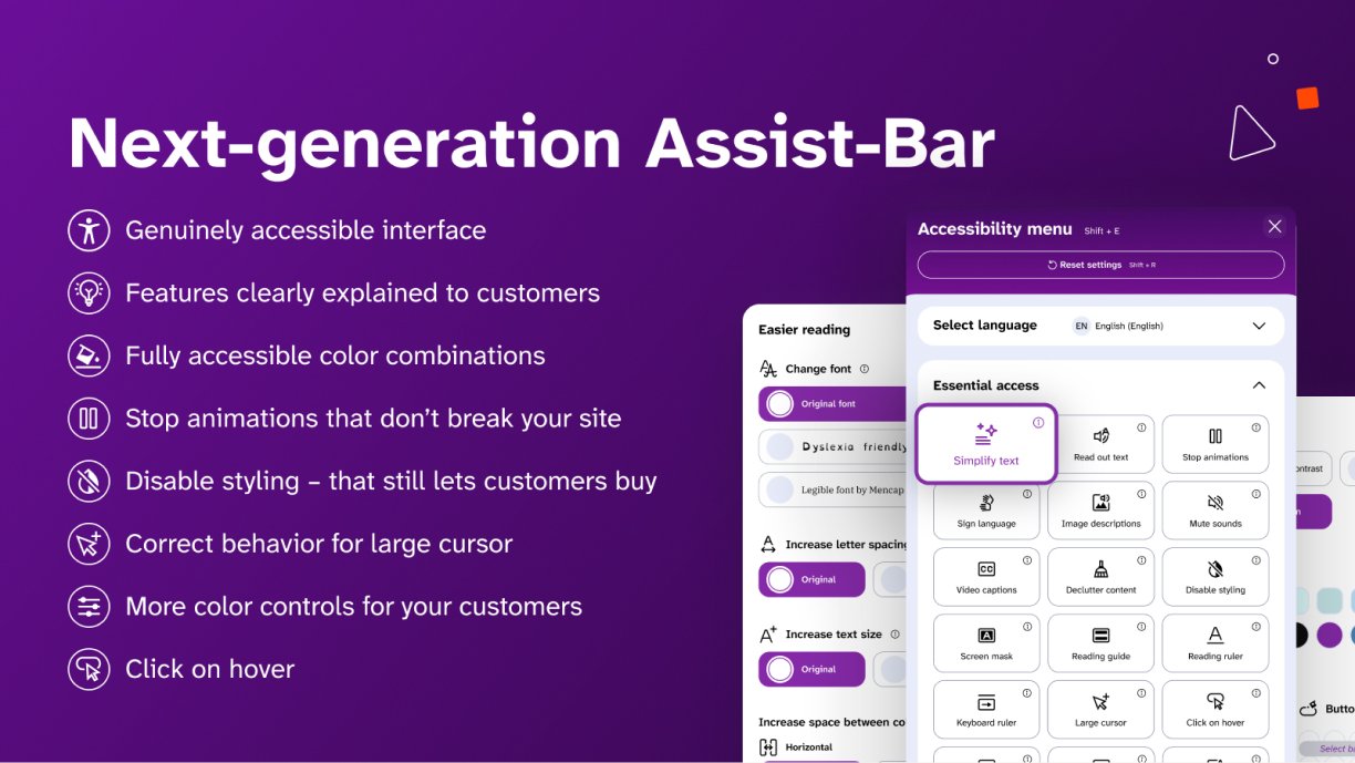
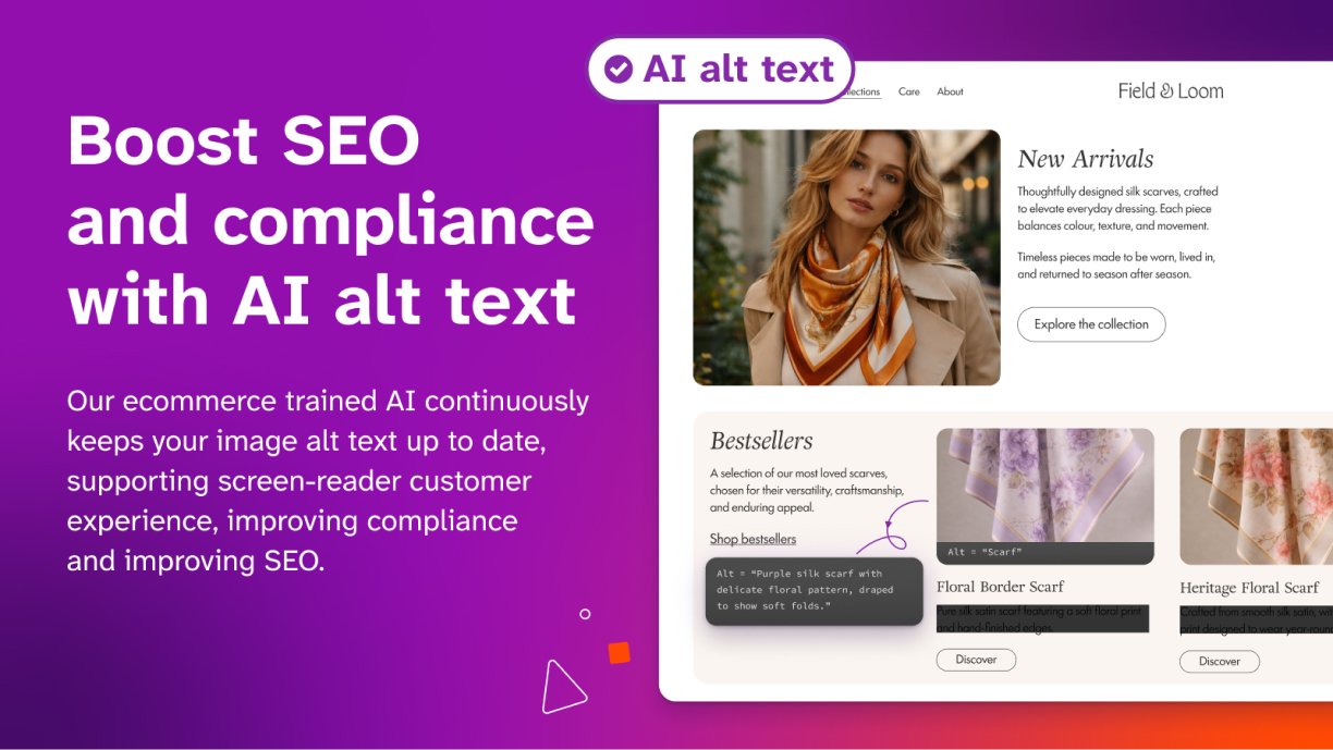
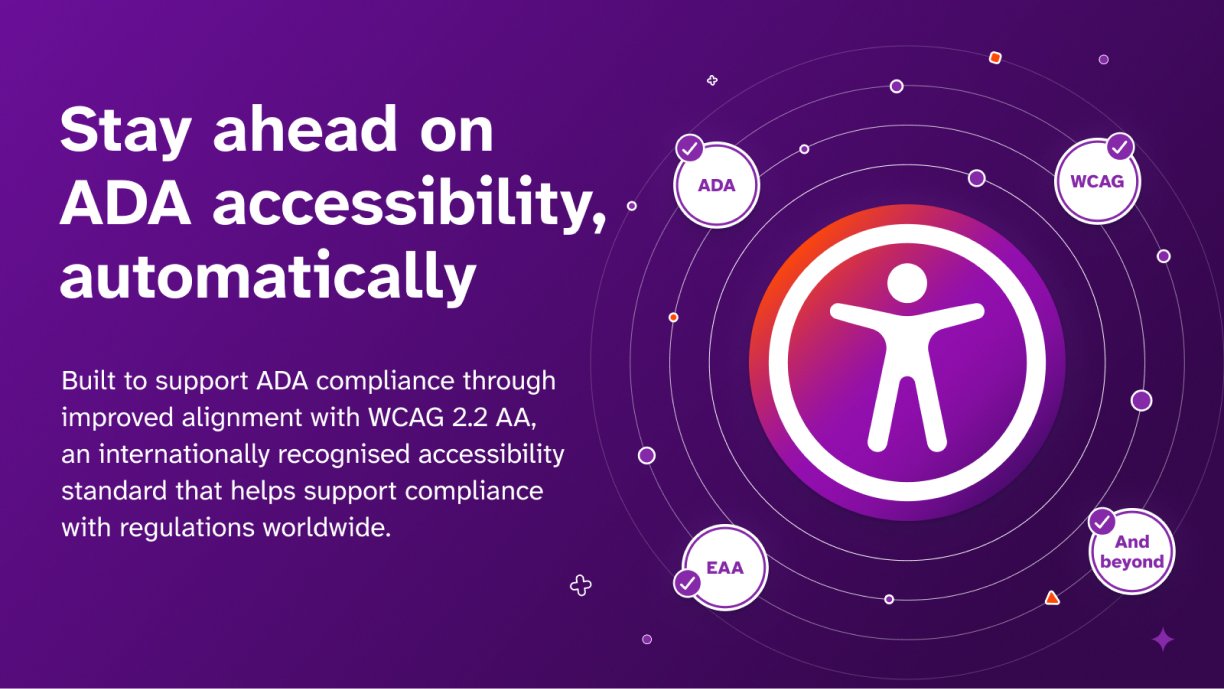
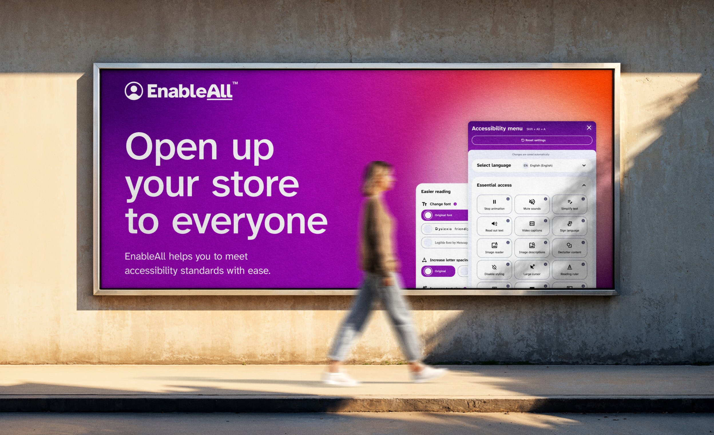
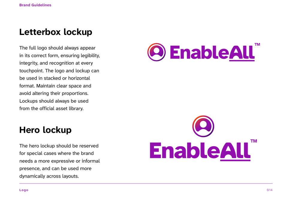
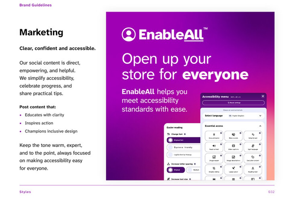
EnableAll makes an accessibility widget for Shopify stores, and asked us for a full rebrand with the freedom to start from scratch. We designed the identity, the brand book, the widget interface and the website. The standard was WCAG 2.2. No design meets every need, so the work was choosing where to bend, and keeping the brand lively while we did.
A category built on tech, rebuilt around the people using it.
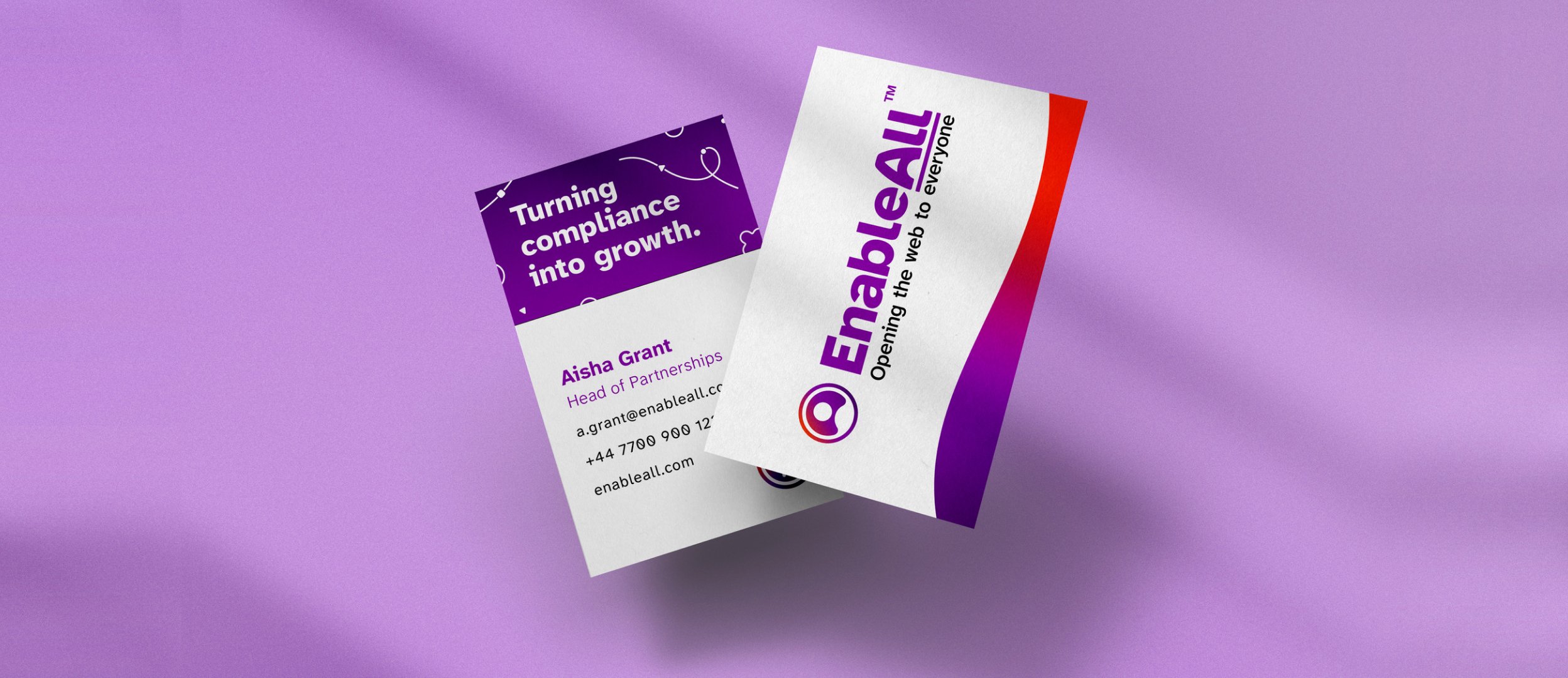
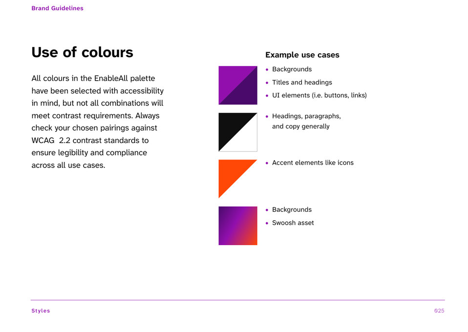
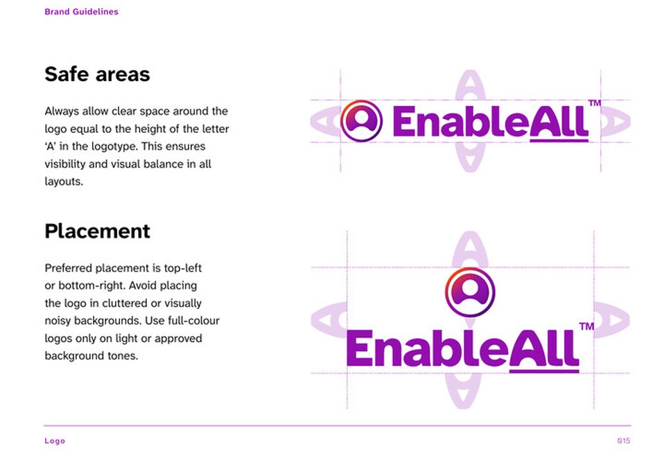
The other brands in the space leaned towards tech, and felt cold to the people they served. We went the other way. Purple, a colour associated with disability brands, carries the identity. Orange adds warmth, and photography of real people in warm tones puts the users front and centre.
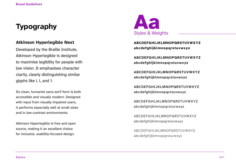
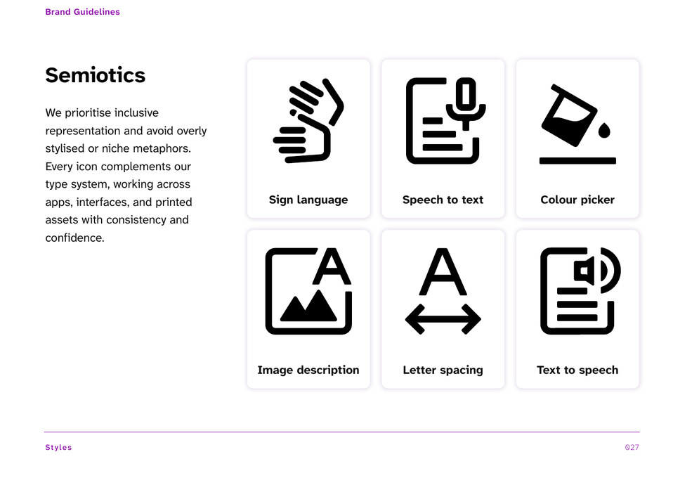
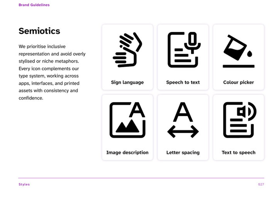
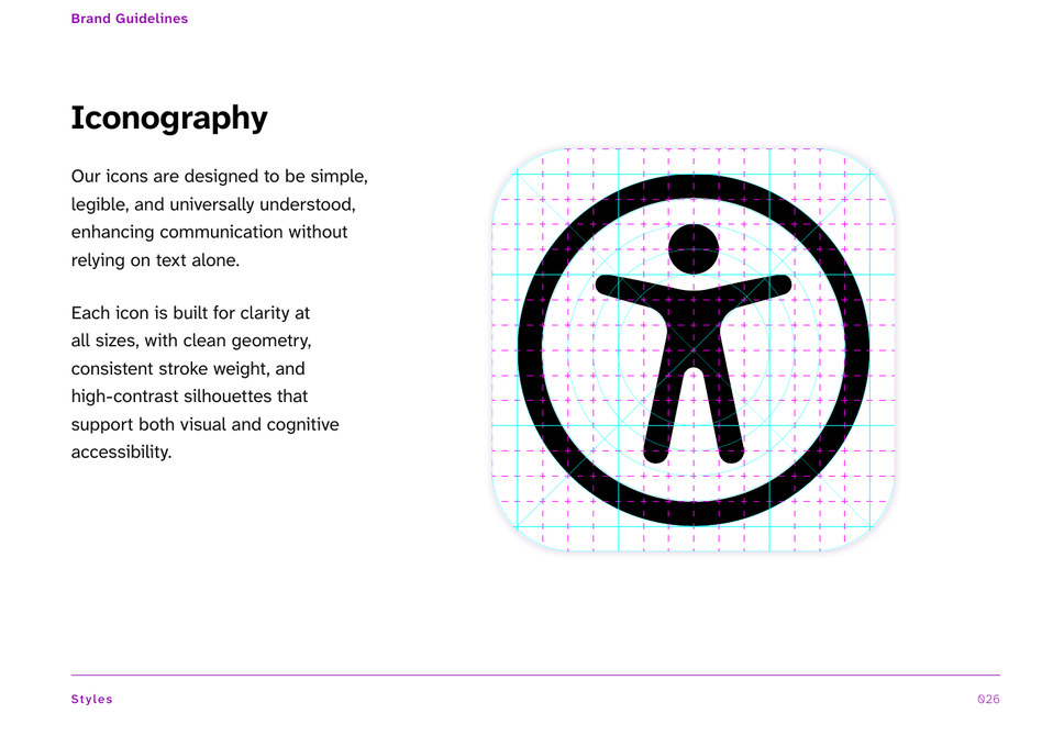
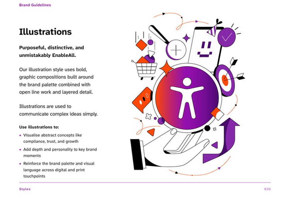
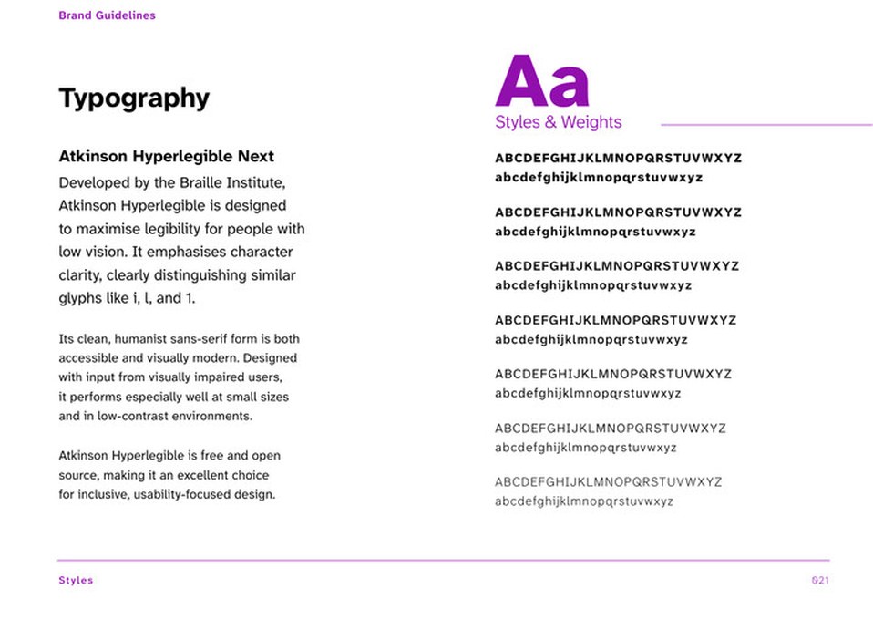
Nothing is ever fully accessible, so some concessions are unavoidable. We chose Atkinson Hyperlegible for the type and built colour, type and icons into one system that runs through the widget and the website. An illustrator drew the characters, with Kandinsky’s arrangements of shapes as the cue, and no blobby figures.